Meteorology
This lesson: Map Symbols
This month I will try to explain to you, the symbols that you are likely to see on a weather map on, say The Weather Channel or whatever your favorite news station may be. I will briefly go into the meaning behind them and why they are important to have on a map. It helps you if you want to forecast ahead a little on your own. I will go over the cold front, warm front, occluded front, high pressure, low pressure, isobars, and storm symbols. If you have further questions you can email me or visit the Weather Channel.
What reason would you need to know what the symbols mean? Well, it is a way for you to see what is coming toward your area by seeing symbols, associating them with the weather they usually represent and taking a good guess as to how the weather could be, soon.
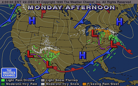
Let's first take a look at a map and familiarize ourselves with what we see.

As you can see, it is from the Weather Channel web site. It has almost all of what I am to write about now. I ask that you refer to this map when I discuss each point as to keep from adding too many images and keeping the download time shorter. If you have a problem looking back too often, e-mail me and I can add the images to help you.
The first symbol to discuss is the cold front. The blue line represents the cold front with the triangles facing the East Coast. The reason for the color and the symbols is just to make a representation of "cold" and blue is considered a "cold" color. The cold front is an approaching cooler air mass that usually brings in rain and in the summertime, thunderstorms. It is often a front that originated in Canada that is moving southeast to east. When moving, the front can combine with a warm mass, and produce the rains. If the cold front combines with a warm front, it causes what is called an occluded front.
First, we will discuss the warm front. A warm front is the opposite of the cold front as it is a warm air mass that usually starts in the southern region and moves easterly and northerly. A red line represents it with half circles facing the West Coast. Red is considered a "warm" color, which is why it is representative of a warm front.
An occluded front is a front of two air masses that have combined from chance. A warm and cold front combination creates a stranger weather pattern than is seen with a cold or warm front by themselves. Usually the weather is worse because there are two air masses working in tandem, and as we know from my CLOUDS page, warm air can hold more water vapor in it than cooler air. When the combination is occluded, the warmer air brings in the water vapor and the cooler air then squeezes it out. The occluded front is symbolized on a map by a solid purple line with triangles and half circles on it on the SAME side.
A stationary front is exactly that: An air mass that has stalled over an area which can result in prolonged weather in that area. There may be two or more reasons why this happens. The first of which is the counter action of a high pressure and a low-pressure system holding the air mass in place. Another reason is that there is nothing present to move the mass along, sort of the opposite of the two pressures systems counter acting each other. The stationary front is symbolized with an alternating red and blue line with a corresponding blue triangle and red half circle, signifying the two air mass frontal zone stuck in place. The direction of the shapes correspond with the way they normally would look if they were a front by themselves (Red half circles aimed toward the left, blue triangles aimed toward the right).
Troughs, and clippers are just dips in the jet stream where a low pressure or high pressure is swinging the air mass south, bringing cooler air from the north which often results in a storm pattern. Clippers are fast moving events that can move along at over 40MPH! Purple dashed lines that will usually be in a north south direction symbolize these.
High pressure symbols--the big blue "H", is signifying an area where the pressure is high--or the air is sinking from above. This is the result of air cooling and falling due to the physics of hydraulics and air masses. This phenomenon happens at the poles more often, but it happens elsewhere as well. In a high-pressure area, the weather is usually calm as air is now sinking and not bringing water vapor higher for condensation. If you have a barometer, you will see the mercury (or whatever the fluid or mechanism may be) is in the high range and on some, it says "fair weather".
Low-pressure symbols--the big red "L" is the opposite of a high pressure. The air is rising from the heating of the earth's crust from the sun and again, from the physics of hydraulics and air masses, warm air rises. Well, with warm air also comes more moisture, and in the higher elevations, the water vapor cools and forms clouds. Often, a Low-Pressure system produces weather. It is between the Low Pressure and the High-Pressure that we find the isobars.
Isobars are the thin black lines that surround a low or high-pressure zone. These are representations of a pressure gradient, which is a pressure change over a given altitude, similar to a gradient on a map where mountain altitude changes are signified by gradient lines. When these isobars are close together, the pressure change is greater in closer proximity and windy conditions often occur. These winds are the result of air rushing to take the place of rising air in a low-pressure area.
Other things on the maps are usually color codes for temperature and precipitation measurements. Different maps will have different colors, but there is always a key to the color-coding and you can figure out what they mean.
An interesting note: When you see a picture of a satellite photo of the earth, it has been doctored a bit so that we can see the outlines of the coasts and other points in the country. The reason for this is that if we were to look at a normal picture of the satellite, we would not be able to differentiate between clouds and the earth. The mountains and lower areas of land are also added in to highlight where certain points are ion the map. Obviously the lines between the states are drawn in as there are no border outlines ion the earth itself.
Where do they get the satellite pictures? There are several satellites in space gathering tons of information, but the one we usually see is the satellite. There are others in the world, but we are concerned with the United States for now. (QUESTIONS for other area can be asked by clicking on my email link below). The pictures are fed to any number of using agencies and can be accessed on the web by viewing the maps provided by the Weather Channel.
Again, please wend me some comments and let me now what you think. If you find a site, which has weather map images, please tell me. I will add them to my site and set up a link to it.
||main||cosmology||personal||mark||links||meteorology main page||
Eric Tallberg
Jan 14, 1998